
One Chart to Explain it All
(With apologies to J.R.R. Tolkien and his famous line from The Lord of the Rings, “One ring to rule them all.”)
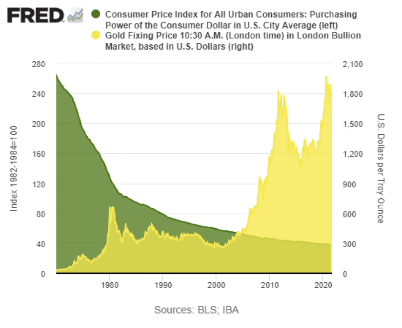
We have published this chart before, but it tells the story of gold’s rise overlaid against the dollar’s loss of purchasing power so completely that we present it again with no commentary.

Okay, one little bit of commentary. We just saw this talk, apparently to a Rotary Club, by the chairman of the House Budget Committee, Kentucky Congressman John Yarmuth.
While the above chart displays the result of US monetary policy, in this you will see how the US ended up with $30 trillion in unpayable debt. Here is a link to the 2021 video in which Yarmuth says that “We don’t really need to pay for Federal spending or debt. We are like the banker in monopoly,” he explains. “We create the money.”
And he’s the Budget Chairman.
That explains a lot.
We will leave matters there without any additional commentary.