Looks Like Gold and Silver Are Breaking Out!
We don’t spend a lot of time showing you gold and silver price charts. But we really think you should see these!
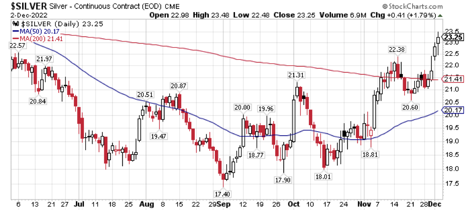
First silver.
This silver chart shows the short-term (50-day) moving average (blue line), and the long-term (200-day) moving average price (red line).
As you can see, this past week silver has exploded to the upside. Its price traded down to, and tested support at the short-term moving average a couple of times in November, bouncing off that support line. Within the day it raced higher and it has now moved convincingly about its long-term moving average.
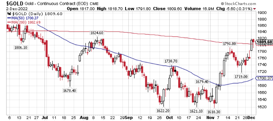
The gold charts appear to confirm a breakout in precious metals. Over the last few months, the gold price has run into overhead resistance at the 50-day moving average. A powerful bull move in the first ten days of November penetrated that resistance. Now gold has greeted December by closing over the long-term moving average on both trading days.
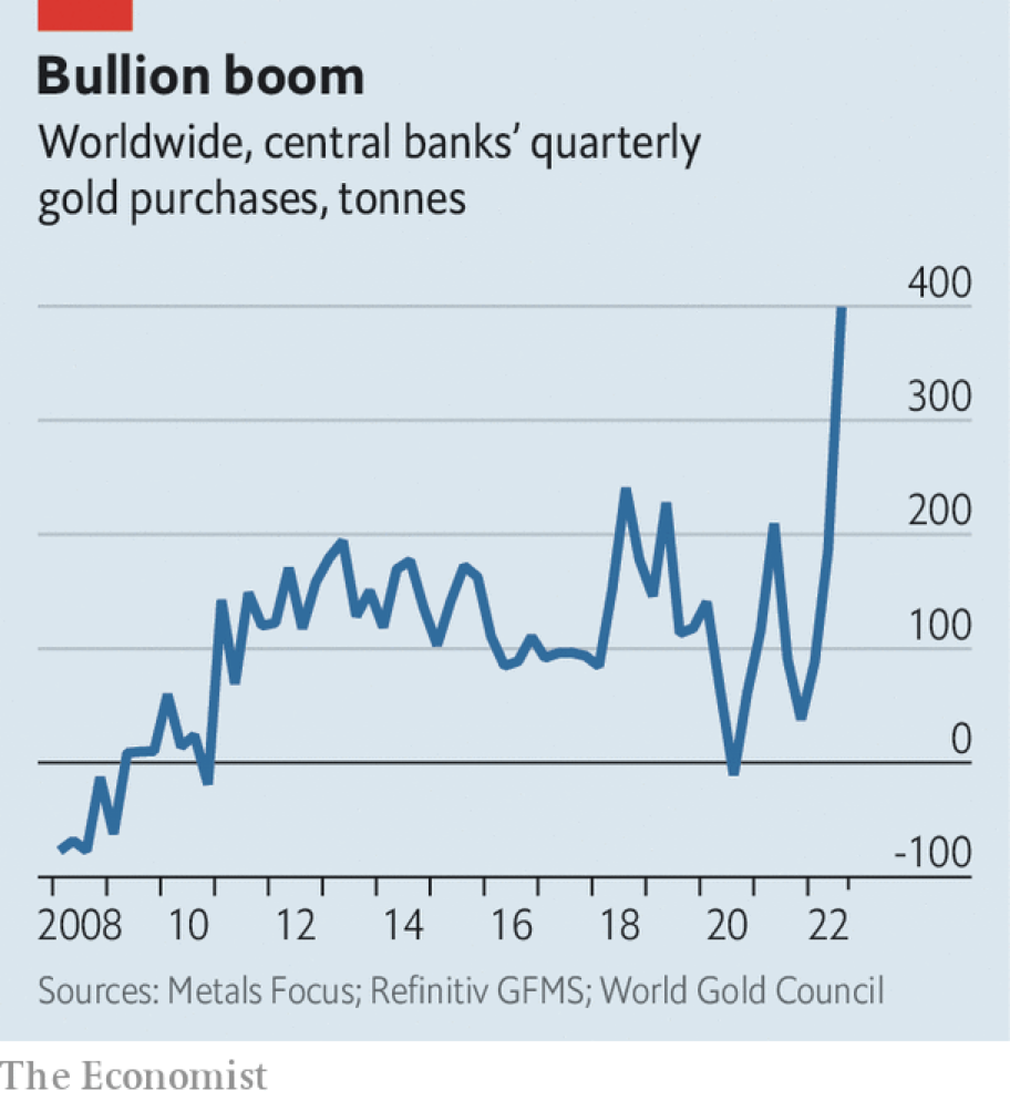
Charts are an important tool for understanding where we have been and they can indicate momentum and trajectory as well. But we always like to add some fundamental observations that buttress the technical picture. In this case, the fundamental news is central bank gold buying that we have discussed often (see HERE and HERE).
Now The Economist has taken note and provides a graphic illustration of the scope of this important megatrend in an article called Why Central Banks Are Stockpiling Gold.
Remember that you can always speak with a Republic Monetary Exchange gold and silver professional to learn more about precious metals investing.