
Every Picture Tells a Story
Why the American People Must Own Gold and Silver!
Today we are going to (mostly) dispense with our own narrative and let you just see for yourself what’s going on in our economy. These pictures will depict some of the mess we are in. They make self-evident the need to own gold and silver as protection from an unstable monetary system.
Because he is the former US Budget Director (under President Reagan), we decided to select the following charts and some explanations from David Stockman. His excellent newsletter is called David Stockman’s Contra Corner.
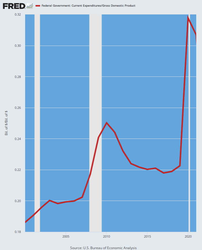
First off, a graphic of federal spending as a percentage of total US productivity (gross domestic product). You might call federal spending off the charts:
Federal Spending Share Of GDP, 2000 to 2021
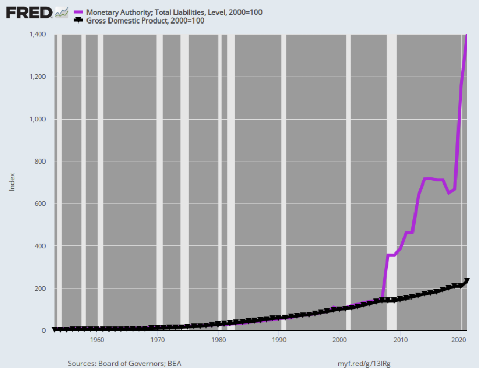
The next chart shows the way this off-the-charts federal spending was enabled by a massive explosion in the Fed’s balance sheet (the purple line, think of that as assets the Fed purchased with money in simply created out of thin air).
The Fed’s skyrocketing balance sheet is wildly out of proportion to economic growth. Stockman notes that since the Great Recession, “the Fed’s balance sheet grew by an absurd 17.4% per annum during the next 14 years, rising from $900 billion to a recent peak of nearly $9 trillion.”
Index of Federal Reserve Balance Sheet Versus GDP, 1953 to 2021
The next chart shows how bubbles are created. It depicts the stock market, using the Wilshire 5000 index, depicting how it has grown completely out of proportion to productivity, and GDP.
Stockman points out that through the end of 2021, the stock market “rose by 600%, even as the GDP increased by only 66%.”
“There is simply no stable and sustainable financial universe in which stock market capitalization grows 9X faster than the aggregate national income for an extended period of time. The vast disconnect shown below, in fact, is accounted for by the rampant money-printing in the Eccles Building.”
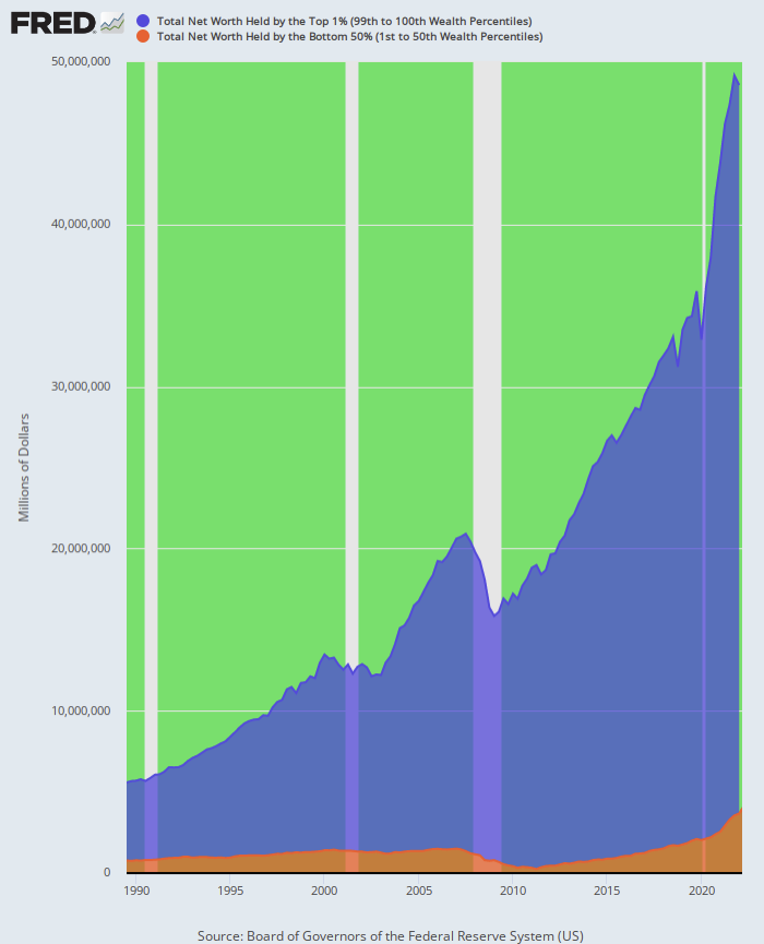
Stockman makes clear that the prevailing system of made-up money has grossly exaggerated the wealth divide in the US, which is exactly what crony capitalism can be expected to do.
“In round number,” says Stockman, since 1989 “the top 1% gained $40 trillion of wealth over that 33-year period compared to the mere $3 trillion gain of the bottom 50%.
“In more mundane terms, there are currently 65 million households in the bottom 50%, which have an average net worth of just $56,000. This compares to the 1.2 million households in the top 1% which sport an average net worth of $38 million.
“Needless to say, there is no reason to believe that left to its own devices free market capitalism would generate this 680:1 wealth differential per household. Indeed, three decades ago—and well before the Fed went into money-printing overdrive—the per household wealth differential between the top 1% and the bottom 50% was barely half of today’s level.”
Net Worth of Top 1% Versus Bottom 90%, 1989 to 2022
That is enough for today except to say that made-up, fiat, unbacked monetary systems are highly unstable. They remove spending discipline from the authorities, enable cronyism, and create massive wealth polarization.
On the other hand, they eventually wake people up to the government’s flimflammery. Speak with us about protecting yourself from the creaking, swaying, toppling fiat monetary system with gold and silver.